I have omitted confidential information in this case study. All information in this case study is my own and does not necessarily reflect the views of Arrive.
Background
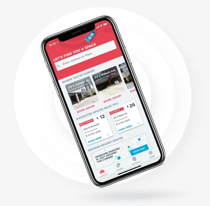
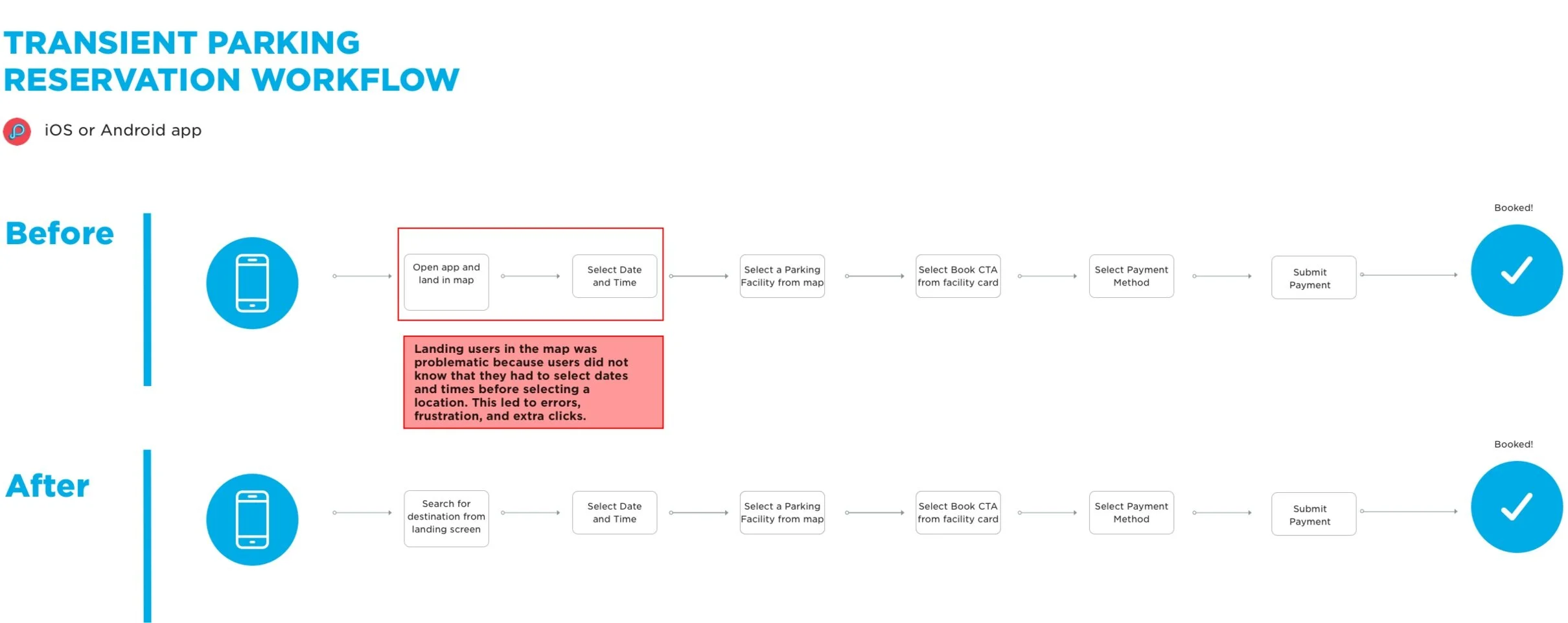
ParkWhiz has an iOS and Android app that helps users find parking garages and lots near their destination, frequently at a discount. Before the redesign, the iOS and Android apps had inconsistent experiences from one another. Both apps were previously built and designed by developers, providing us with an opportunity to make a massive impact in the customer experience (CX). The redesign of the app was purely led by the CX and outcomes from user research. I started tackling the largest usability problems seen in testing that to have greatest impact on conversion within the booking flow.
My Role
I led the UX design and process of redesigning the ParkWhiz iOS and Android apps. I was responsible for the experience strategy and partnered with a UI Designer and a UX Researcher. We collaborated to come up with efficient user flows that improved conversion and have since been adopted as industry standards by competitors in the space.
Discovery
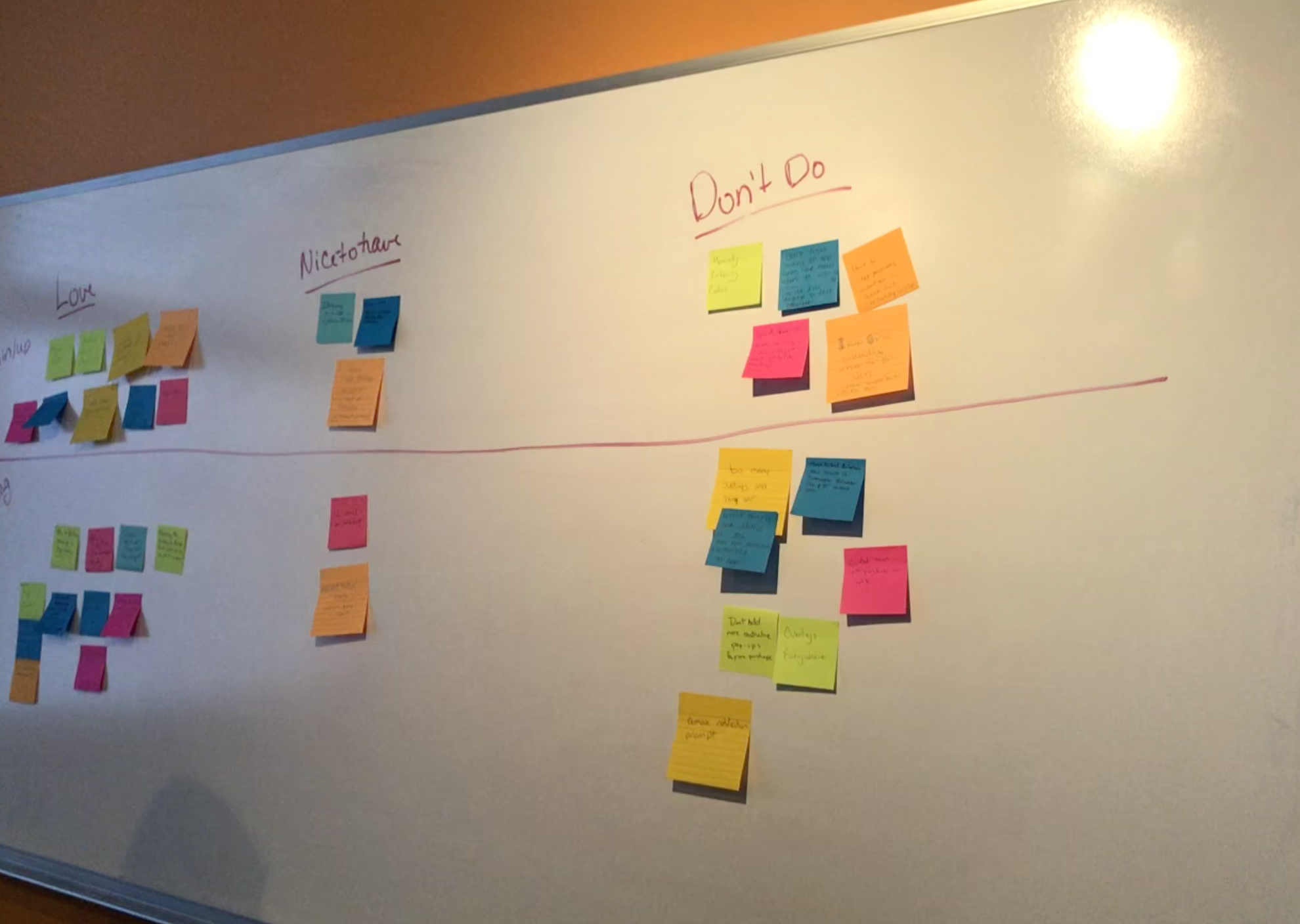
Here are some outputs of our workshop that included cross-functional team members.
Discovery included sketching, user testing, concepting with a cross functional stakeholders (Marketing, Customer Service, Product, and Engineering), and competitive analysis. We started by benchmark testing both Android and iOS platforms and presented research to stakeholders and the executive team.
I co-led task-based usability testing alongside our contract researcher with new users unfamiliar with our brand and repeat users from our database. Remote unmoderated testing was completed through a panel within our usability testing tool- Validately. Moderated testing with repeat ParkWhiz users was completed in a remote, moderated format. These sessions were also recorded through Validately.
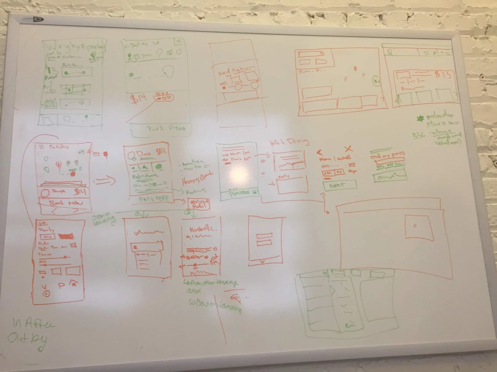
Here are some very early sketches concepted with our visual designer.
In the concepting phase, we brainstormed ideas by sketching. Additionally, I led multiple brainstorming sessions in the Google Design Sprint format. Participants included Product Managers, iOS and Android developers, back-end development, Customer Service team members, and Market Development leaders who represent the parking operator side of the business. We synthesized the outcomes of these sessions and applied our learnings to the final designs. By taking a holistic approach and including user research and ideas from stakeholders throughout the business, we were able to ensure we were not missing critical elements of the product experience.
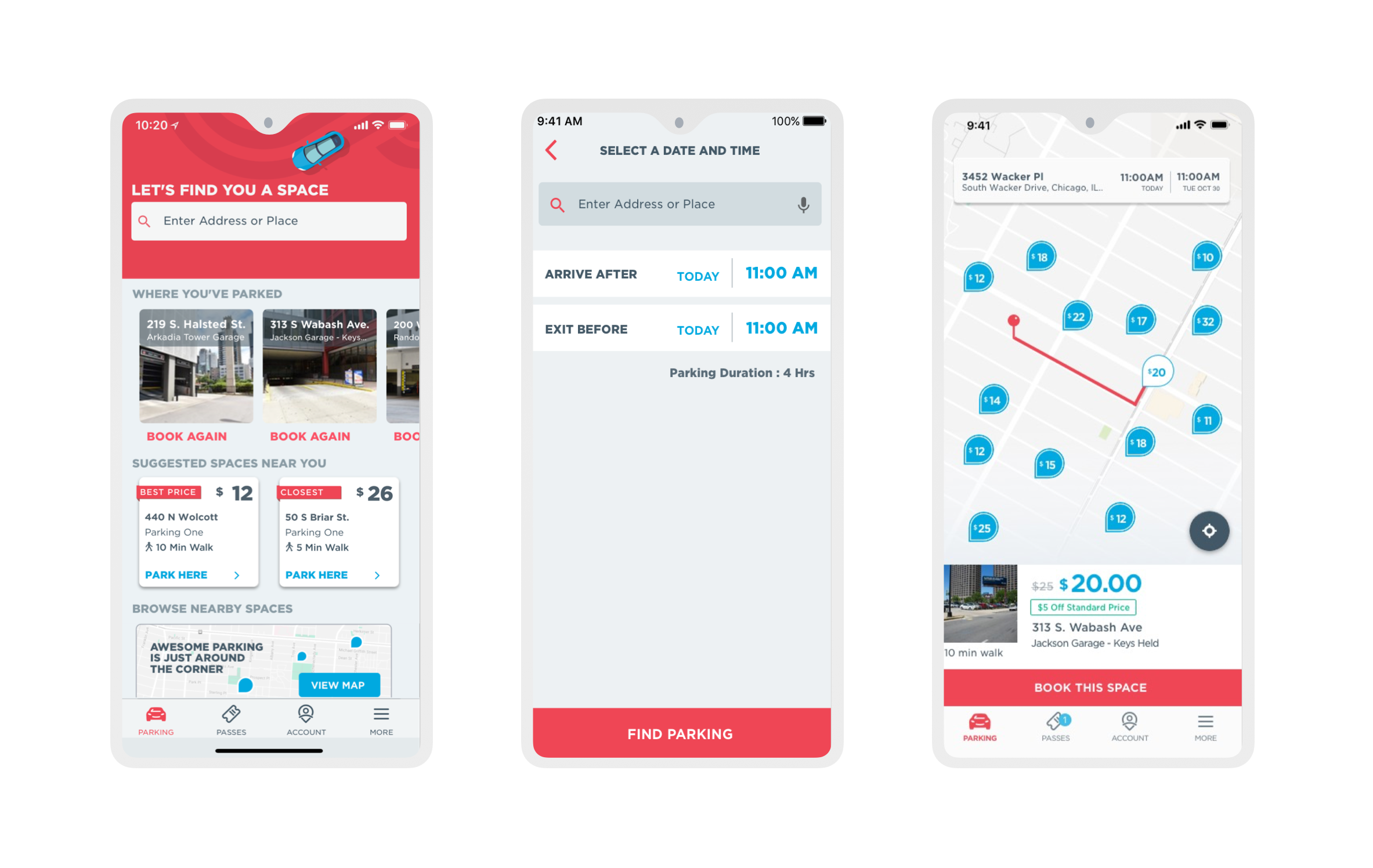
Original iOS App
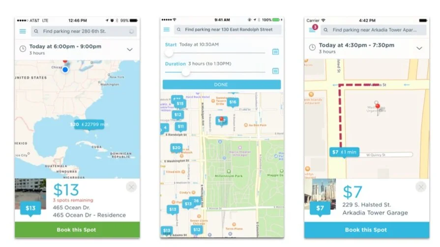
Users were landed on the map upon downloading the app. Time pickers were sliders and difficult for users to control.
Measuring Against Competitors
To learn about what was working well in the space, we also user tested our competitors. When we asked users to rate the ease of use on ParkWhiz, SpotHero and Parking Panda, ParkWhiz was rated the lowest. We shared this information with internal stakeholders to get additional buy in (and time) for the large scale redesign.
ParkWhiz
Out of 33 participants, 13 participants considered PW very easy, 9 participants thought it was easy, 6 thought it was neither difficult or easy. 2 found it difficult and 3 found it very difficult
Spot Hero
Out of 10 participants, 8 participants considered SH to be very easy, 1 thought it was somewhat easy and 1 found it neither easy nor difficult
Parking Panda
Out of 11 participants, 8 participants considered it very easy, 2 participants thought it was easy and 1 found it somewhat difficult
Validation
Because of the size of the team and the speed at which we were moving, we decided to validate our final designs by user testing with real users in our office. We worked closely with developers to plan testing with completed builds. We were in constant communication with development to ensure our testing was timely. We needed beta builds ready and functional when test participants walked through the door. This round of user testing was the first time users were brought in to the ParkWhiz office- face to face! Beta testing in person helped us work through undiscovered bugs and highlighted modifications that could increase affordances and overall usability. Seeing the excitement in users faces about the new experience was rewarding and validated that we were solving for pain points that existed in the previous version of the app.
Final Deliverables
We worked with QA and Product Managers through the end of the launch to ensure the designs and functionality were up to par and every last detail was as intended. This required functional testing as a team and visual quality assurance.
Results
The redesign project was most radical update since 2016. App store rating went from 4.0 to 4.9 within 6 months after launch. Bookings climbed 7 percent in Android and 6.9 percent in iOS within the 4 weeks after release.
iOS Search Funnel
Android Search Funnel
Concluding Thoughts
The total project above took about 6 months from end to end, discovery through development. The business allowed us to implement changes across the whole booking experience simultaneously, because of the compelling usability results presented. The success of this project was due to a great amount of collaboration across Product, Design, Development, partnering with stakeholders and of course, USABILITY RESEARCH was king.